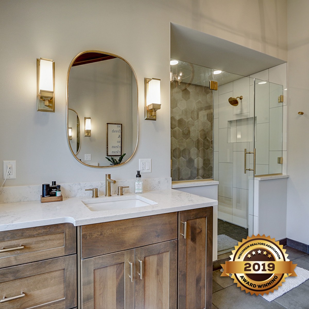
This second-floor master bathroom was expansive but not very functional
for these homeowners. They felt that the awkward layout, monotone color scheme, and gold trim left the room feeling flat and dated. What the homeowners were looking for was a bathroom that made better use of the large space, eliminating the unused soaker tub and felt like a warm, welcoming spa.
In order to remove the monotone, cold impression the homeowners currently had of their master bathroom the newly designed space was updated with a warm, rustic design that featured subtle textures and soft neutral colors to keep the room from feeling flat. The cabinetry was updated from heavy, dated oak to a lighter saddle stained alder wood custom vanity. The light stain ensured that the natural variations of the wood would shine through and provide dimension and texture. The flat gray walls were painted a soft, neutral gray that provides a warm backdrop to the entire space.
An existing large built-in soaker tub, was a big point of concern for this couple’s remodel. It was clunky, dominated the space, was hard to get into, and seldom used. Their directive was clear: remove the tub and redesign the space in a way that was more functional and visually appealing. By removing the tub, this created a large recessed area that was filled with abundant natural light and became the ideal location for separate his and hers custom vanities.
To create a soothing and balanced prep area, identical custom alder wood vanities were built into the space.The dated bright gold fixtures were replaced with softer brushed gold fixtures. The brushed gold accent was carried throughout the space with additional sconce lighting as well as the mirror frames and glass shower door hinges. Each vanity has ample counter space with granite countertops and undermount sinks. The custom vanities feature plenty of storage, something that was important to the homeowners, with each vanity having identical drawer, cabinet and pull out storage with electrical as well as built-in trash receptacles.
By removing the soaker tub and relocating the vanities, this allowed for the addition of a large walk-in spa sized shower. Reminiscent of the size of their favorite spa they wanted a shower that was in proportion to the size of the room. This large shower features dual rain shower heads in brushed gold, that pop against the oversized polished white tile, the dark grout lines provide contrast as well as texture. A full hexagon tiled accent wall helps add warmth and texture to the shower as well as plays with the oversized tile in an unexpected and eye-catching way. A large glass shower door and two half walls marry form and function within the shower.
To complete their spa experience, these homeowners decided to replace their small walk-in shower with a full sauna unit. Installing the unit created some unexpected obstacles that had to be overcome. Since the unit’s dimensions were larger than a normal fit-in unit, new framing and re-drywalling of the area was required. Once that was addressed the sauna could be installed, along with new flooring and electrical for the in-unit speakers. Completing the ultimate relaxation destination for these happy homeowners.
The previous ceramic tile flooring was small-sized and added to the monochromatic feel of the room. To eliminate this a darker, oversized ceramic floor was installed to anchor the space and add contrast to the lighter walls.
To enhance the rustic warm aesthetic; saddle stained beams were built and added to the ceiling. Both creating a focal point as well as drawing the eye up and emphasizing the height and space of the room. These beams, however, were not without their own obstacles. Given that the vanity and toilet portion of the bathroom included a jut out that the rest of the room did not, this created a dilemma with how to center the beams in the space. In order for the beams to be center within the entry of the bathroom, and to be center with the electrical for the chandelier, this caused them to be off-center in the rest of the bathroom. By finishing the beams in the same shade as the vanities, it tied the beams in with the rest of the room in such a way that the extra few feet were not a visual obstacle.
The unique chandelier provides ambient light and an extra element of texture to the space.